P1: Produce a proposal for the original media product to meet a client brief.
P2:
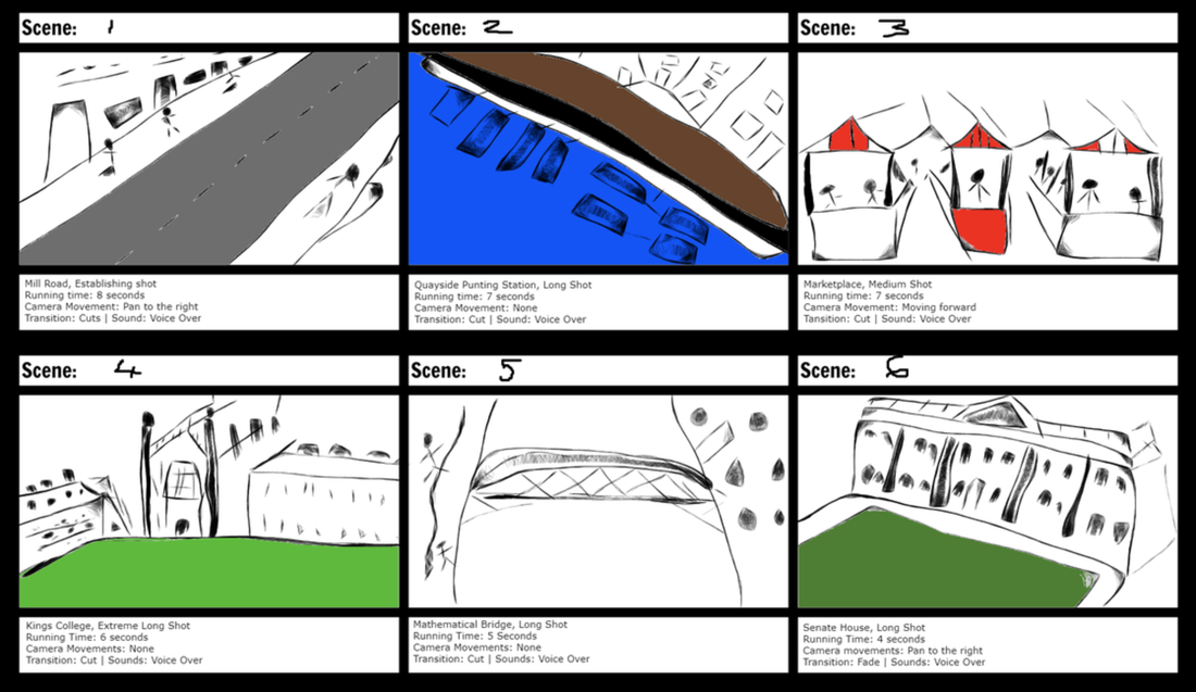
Storyboard draft
Script Draft
Font Ideas
Below I have come up with several ideas for what fonts I would like to use for each type of text I will have in my video. The fonts are displayed in large with the type of text I'll use them for written in the font. Under each font example is the name of the font itself.
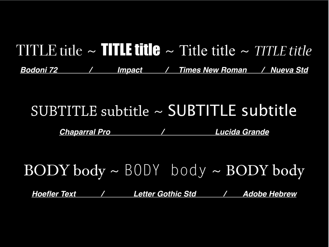
Below are the potential fonts I chose listed alongside their positives and negatives.
Title Fonts:
Bodoni 72 -
Pro's: It is very formal and appropriate for the theme of the video.
Con's: It's commonly used and may seem amateur as it's widely recognised.
Impact -
Pro's: It is very bold and eye catching as well as being aesthetically pleasing.
Con's: It doesn't match the formal theme of the video and seems quite informal and unprofessional.
Times New Roman -
Pro's: Like the 'Bodoni 72' font, it is very formal and appropriate.
Con's: It is also very commonly used and may seem cliche if featured in my video.
Neuva Std -
Pro's: It is more italic and aesthetic than the other potential fonts but it keeps it formal structure.
Con's: The font is quite thin and may be lost in the video and not catch the eye of the viewer.
Subtitle Fonts:
Chaparral Pro -
Pro's: It has a lighter and slightly less yet still formal appearance which would match any of the three title fonts except 'Impact'.
Con's: It has similar aesthetics to the font associated with type writers which isn't the look and feel I'm going for in the video.
Lucida Grande -
Pro's: It is a thinner and more formal counterpart of the 'Impact' font which it would look visually pleasing alongside of.
Con's: It would be incompatible with any of the other fonts apart from 'Impact' as it is more simple rather than traditional.
Body Fonts:
Hoefler Text -
Pro's: It is traditional and easy to read font which would match with most of the other fonts if I decide to pick them.
Con's: It is slightly curvy and italic for a body font.
Letter Gothic Std -
Pro's: It is an even lighter counter part of 'Impact' and 'Lucida Grande' so I could use the three to make the text in the video very visually pleasing.
Con's: It wouldn't go well with the majority of my options when it comes to fonts as it is too straight and uniform.
Adobe Hebre -
Pro's: Very similar to the other font options I've chosen so I can use it alongside them easily.
Con's: It's a bit too bold for a body font and make seem out of place with a lighter subtitle or title font.
M1: Justify content, distribution and marketing methods identified for the planned production to meet the client brief.
Content
The focus of the video is the multiculturalism in Cambridge which I have chosen because I believe it differs from other promotional videos about Cambridge which usually focus on the Universities and other things which stereotypically are associated with Cambridge yet don't really show the ‘culture’ of the inhabitants of Cambridge who live there and make it what it is. A large part of Cambridge is made up from multiple different cultures and therefore I will focus on that in order to portray the real and non commercial culture of Cambridge which I think will fit the client brief very nicely as it’ll be something different and very real.
I will be including shots of Mill Road in Cambridge as it is the hub of culture in Cambridge where shops, cafe’s and food stands from all over the world. This includes British culture but also highlights the harmony between cultures in Cambridge which is something that I think will please the client as it’ll be positively conveying Cambridge’s culture in the Culture Award. I will still be showing the famous buildings which associate with Cambridge, such as Kings College. This is because it is still a part of the culture which the client brief asks me to make it about. Also one of the aims of the promotional video is to promote the city for tourists and a large chunk of these tourists will be enticed by the grand universities of Cambridge.
Distribution and Marketing
If we assume that we are making this promotional video for the Cambridge City Council and not for our course we could assume that the main form of publicity for the video will be it’s distribution through the Regional Culture Awards by the Cambridge City Council. In addition to this the video could be published on the Cambridge City Council’s website which would also be a form of distribution and marketing. Considering our low budget we could realistically post the video on websites such as YouTube and Vimeo in order to distribute the video as well as on social networking sites like Facebook and Instagram through accounts such as the Cambridge City Council as they’d have no problem allowing us to do this as it is to advertise Cambridge as a city.
